 ason and pair those with traditional neutrals and wallah, an event schematic is born.
For the most part, the brides I work with know what they want, and I love that! It is rare that I have to gasp at a color pairing and try to advise them on something different. However, my favorite type of bride is one that has a contemporary edge with a classic fashion sense and is willing to venture out away from the monochromatic or pastels. Conjoining a neutral tone with a more vibrant hue can result in such brilliance! This can be done with fabric, flowers or even lighting.
So, without further ado, here are my personal favorite pairings for 2009. First and foremost, gray is the new chocolate. This color is so versatile, it can go with a vibrant color, a pastel or an Earth tone! In addition to that, the shade of gray can be dark like slate, or as light as precipitous cloud and it would still look good paired with almost any color.
For instance, a medium range gray with a pastel pink is a very classic color combination. It isn't as vintage as black and pink, or as overdone as chocolate and pink. Surprisingly, Tiffany blue and a light gray look fantastic as well.
If you want to be bolder, a slate gray paired with a butter yellow and crisp white looks amazing! Another great color is a rich salmon, lime green and gray! Think about it, salmon with lime on a silver platter generally has a beautiful aesthetic. Or, if you're going for a more sophisticated color scheme, a shimmery light gray with and indigo blue and ivory would be reminiscent of the evening sky.

Earth tones go great with gray! Chocolate, taupe, burgundy, pumpkin, moss green... they all look fantastic! This would be especially nice if you were doing a "rustic elegance " wedding. Gray overlays with a centerpiece of river rocks, moss and beautiful willow branches would make a stunning, yet low key statement.
Vintage 40's is in! During this era, both muted tones and vibrant colors were all the rage. If you look at this era you see Lingerie in pale mauve, deep ivory, la vender, or a buttery yellow. These soft colors are perfect for an afternoon wedding on a summer day.
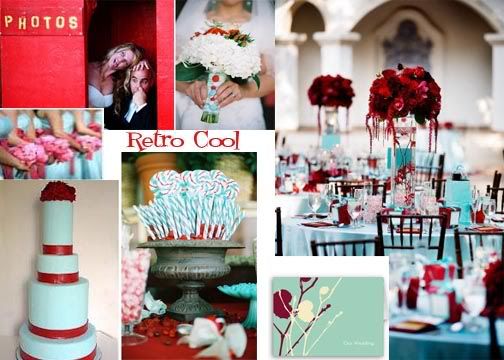
However, you also saw bold pairings like an aquama rine blue with candy apple red during this era. The retro feel of the 40's and 50's is a great place to get inspiration for wedding colors if you're a bride with a bit of an edge. Teal, red and white really pops and is perfect for the retro bride that loves the simple lines and bright colors of the 1950's. As you can see, you will have amazing wed ding photos with this color scheme! The 40's a nd 50's are classically glamorous, mid-century co ntemporary or art deco are both the toast of th e design world because they are still so appealing today.
If you want to wander off into the hipster 60's without doing the bohemian/hippie casual style of wedding, ou could also go with something more funky like chartreuse green, white and aqua. Whatever you decide,
 muted or vibrant, this era definitely has some great inspiration.
Etsy is a great place to seek out the serendipity of vintage colors. :)
Additionally, I am seeing some color combos that are so exciting, as well as extravagant for the eyes. There is deep burgundy and salmon, yes I said it...burgundy and peach! This look is so sultry and can be done in summer or fall!
I also really love a burnt orange paired with a deep teal. It is stunning,
 especially for a rustic, sunset wedding on the beach. It just reminds me of a late summer wedding at the lake or on the beach in the Caribbean!
Another unexpected combination of colors is a deep navy with lilac paired with lilac hues. They are an unusual use of an almost monochromatic color scheme! Finally, I am still seeing brown and pink paired together, but the shades have reversed. We are
 now seeing a more light wooden brown, with a deeper pink like raspberry or wine.
Of course, we are still seeing the classic combos as well. Burnt orange and chocolate brown are still a favorite for an autumn wedding. Taupe, blue and chocolate is still a classic and beautiful combination for a sophisticated summer wedding. The monochromatic white, off white color scheme will never go out of style because it continues to have such a fresh appeal, and the green and cream will live on forever. And thank goodness for that! :)
Well, it is been fun discussing color trends I've seen in the industry but also talking about the trends I see forthcoming. Don't forget to go window shopping and check out the colors they are presenting. This is a great way to forecas
 t the new trends for 2010!
Photo Credits:
Gray & Green Inspiration Board - Brides.com, Tastefully Entertaining.blogspot.com
Aqua & Chartreuse Inspiration Board - Brides.com
Teal & Red Inspiration Board - isawred.com, weddingsonthefrenchriveria.com,knot.com, brides.com
Blue & Chocolate Inspiration Board - weddingsonthefrenchriveria.com, favorideas.com, brides.com, photobucket.
Orange & Teal Inspiration Board - weddingsonthefrenchriveria.com
Burgundy & Peach Inspiration Board - tastefullyentertaining.blogspot.com
Autumn Inspiration Board - tastefullyentertaining.blogspot.com


